Transformation Exam Project
MIND MAP
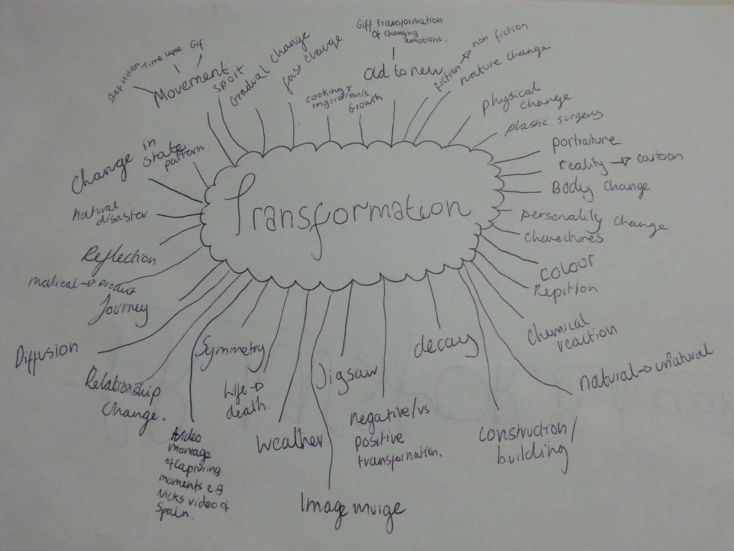
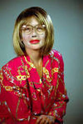
Pintrest board- A range of pictorial ideas.
|
|

|
|
Portrait Transformation- Time
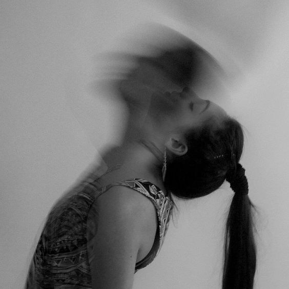
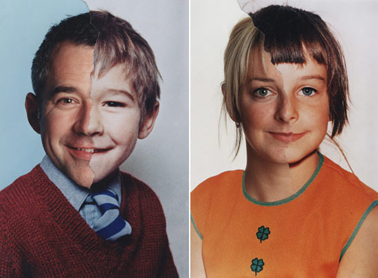
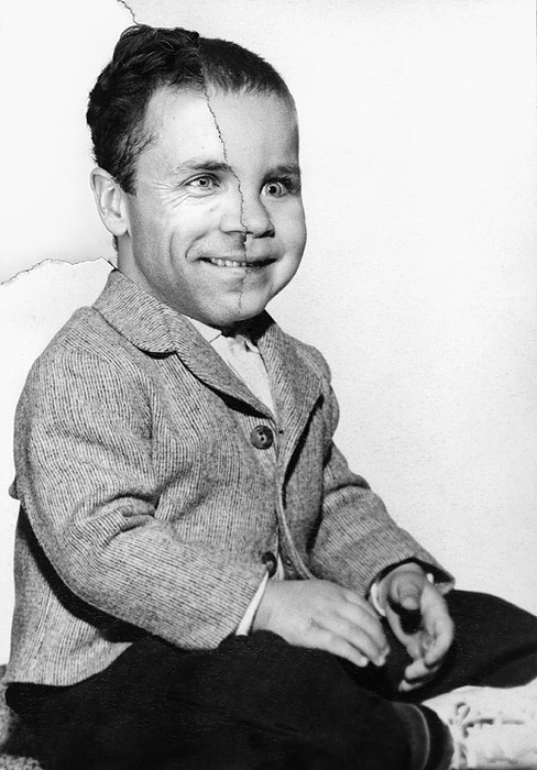
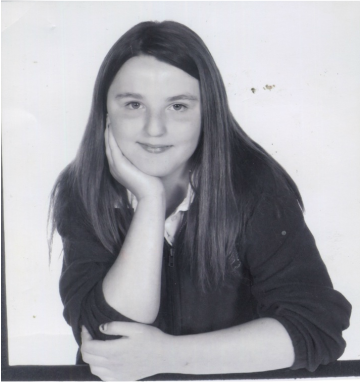
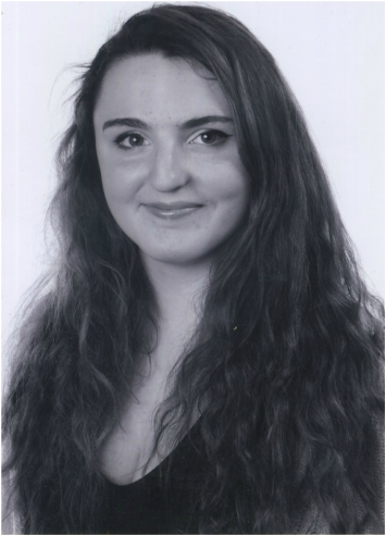
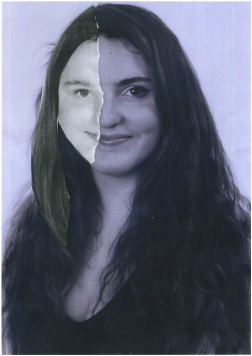
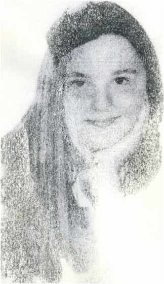
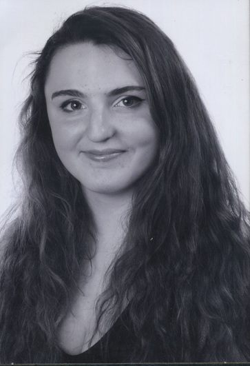
Our first task was focused on a physical, more obvious transformation. By combing images of the youth and elderly, much like Bobby Neal Adam's work (see in next response), time is frozen into one picture. The picture of the elderly and youth merged together explores one's physical transformation through out their life time. The beauty of the merged image is their whole life time transformation is captured in one.
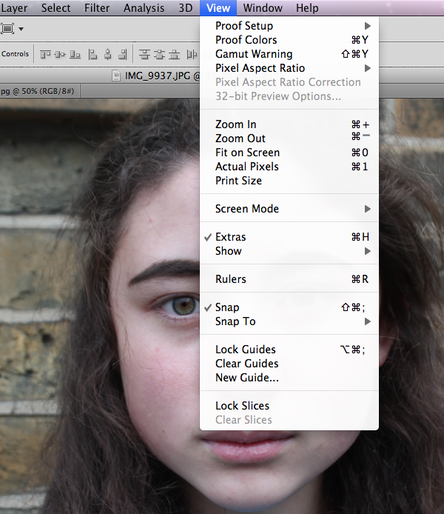
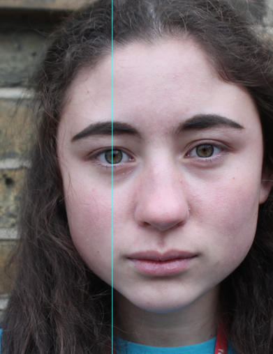
The first step of creating the portrait murge was to select the guide lines in order to line up the transfer image symmetrically by clicking view, new guide.
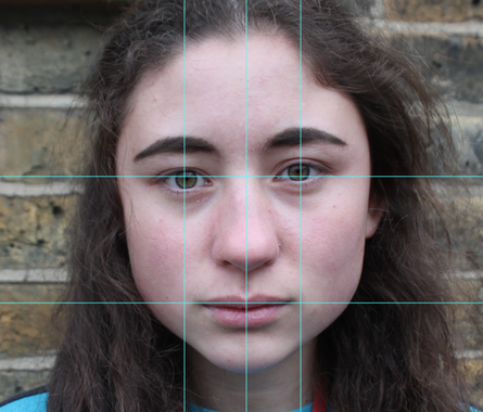
The process is repeated with the other eye and the centre of the nose. Then horizontal guide lines are selected to the corners of the mouth and eyes.
|
Then the guide line must be matched to the centre of the eye.
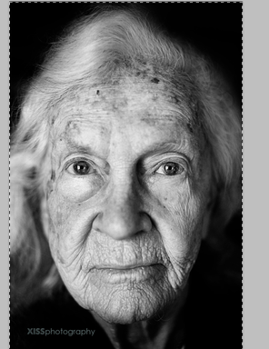
Then the image of the old person is selected by clicking command A then copied with control C
|
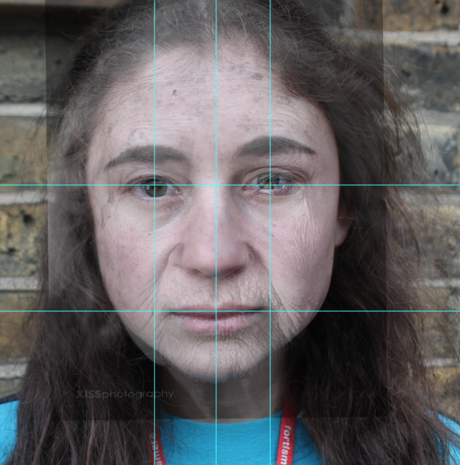
Then by clicking control V the selected image is transfered on to the base image with the guide lines to match up the features. I also changed the opacity of the image of the old person inorder to see the original image underneath so the features could be matched up perfectly.
|
Then the guide lines are deleted and you can focus on refining the image to make it appear more natural and realistic.
|
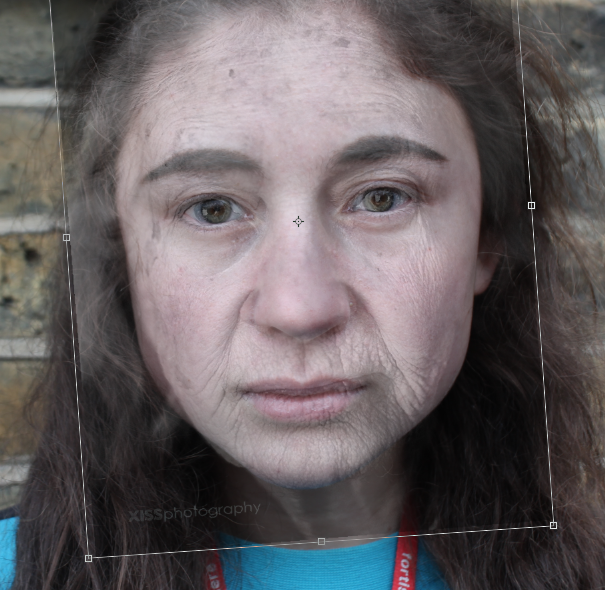
Then by clicking control T the transferred image of the old person can be selected and altered to fit the face shape of the young person. So for this image I had to rotate the face slightly left to fit the eyes together.
|
Then I erased the eyes of the old person to reveal the natural eyes to create more intensity. Then I erased the square outline that appears in the previous images to make the image as natural as possible.
|
|
|
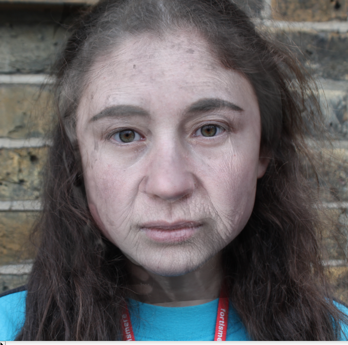
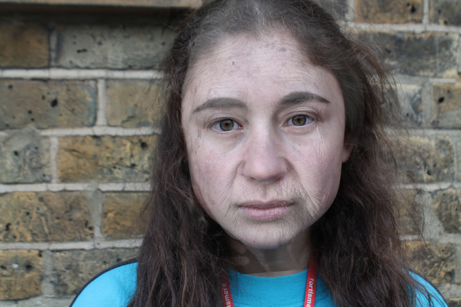
The intentions of the time transformations photos are to capture two different time periods and combine them into one picture. The merged time creates an element of beauty and a feeling of nostalgia.
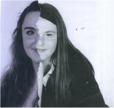
EBI: The photo shopping was more refined. For example in the first image the hair could look more natural.It would also be better if the two images combined were of the same person form two different time zones to make the context more personal.
WWW:The image appears natural and captures an equal balance of both images so both pictures are recognisable in the final result.
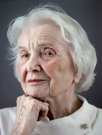
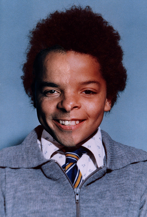
Age Maps By Bobby Neal Adams
Bobby Neal Adams had the intention of discovering ones self through the exploration of combing images from past and present with the hopes of gaining a grasp about the wider picture of someones life. These images demon-straight a sense of beauty. It combines two time frames suggesting in a way a time that although time seems significant in the present you look back on your old self and you realise how insignificant time has been as it is forever continuous and at times you remember any moment of the pass feeling like yesterday.. Neel Adams stated himself that "a jump-in-time occurs at the tear."
|
Adams Began the age map series in the early 90'S using black and white film for his latest images and took the subjects school photograph which was previously professionally taken by the the school. The poses were often not front facing which in a way romanticises them. This particular image has a spooky contrast between the facial features. Especially with the wide eye in the youth image. It also creates a feeling of discontent because of the change in symmetry. Furthermore Adams decided to use the body of the child which creates humour with in the image because of the disproportion of the mini body compared to the adult face. |
|
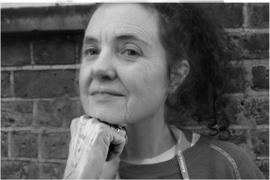
As Morden technology came into the picture Adams mordenized his technique using colour film and straight facing images to create realism. "Every pore, blemish, and wrinkle becomes intensified with the use of color photography, particularly when mirrored against the unblemished image of youth."This image is interesting because it depicts ideas about change and continuity. On one hand you look at the image and you see the same personality and face on both sides of the image but then at a second glance you begin to think about how far the subject has come from that initial image and how the genes, time and environment have adapted the second image to create such change in the subject. |
|
My response
|
|
|
|
What went well: engaging comparison and captures the clear transformation.
Even better if: The features matched each side, especially the hair. It would also be better if the images where in the same contrast of black and white to make the image more natural.
Even better if: The features matched each side, especially the hair. It would also be better if the images where in the same contrast of black and white to make the image more natural.
SAUL LEITER: Retrospective Exhibition
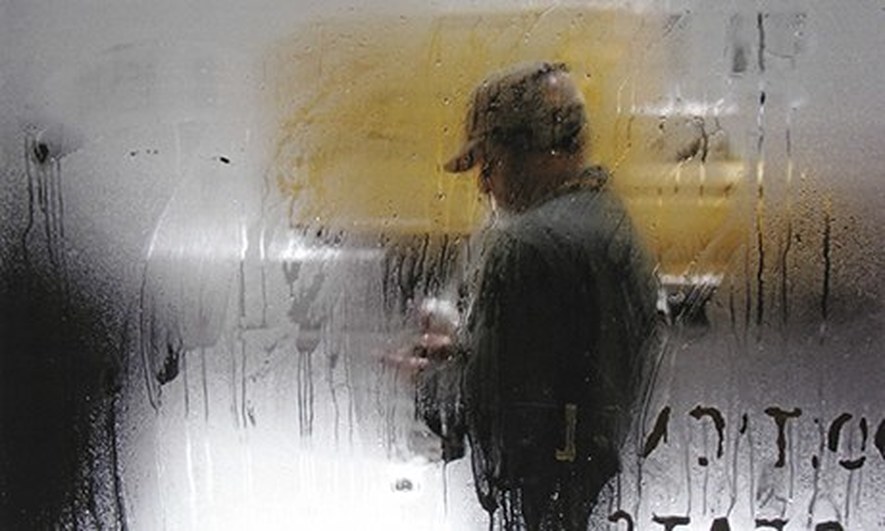
At the photographers gallery in Oxford circus Photographer Saul Leiter created a series of images in 1950's New York. Colour photography was a rare process and often only used for marketing. Leiter's work was disregarded until recently as at the time his colour photography went against the tradition of capturing documentaries.
"In his Through out the exhibition: Photographs, the genres of street life, portraiture, still life, fashion and architectural photography fuse together. The lack of clear detail, the blurring of movement and the reduction in depth of field, as well as the use of windows and shadows as natural filters, combine to create a photographic language of colour and abstraction set against the urban space Leiters work captures an essence of beauty by taking simple scenarios and transforming them into a memorable moment. This is especially shown through his abstract perspectives For example he often shot through reflections of windows, creating double exposures and from an inside window looking out. Thus, transforming an image of a man walking, into an intensified moment also portrayed by the yellow and grey colour contrast. In this specific image the steamed windows and the pose of the man in a cap create a sense of mystery. The contrasting colour of the yellow transforms what could be viewed as quite dull, into a fresh new out look of the photograph.
"In his Through out the exhibition: Photographs, the genres of street life, portraiture, still life, fashion and architectural photography fuse together. The lack of clear detail, the blurring of movement and the reduction in depth of field, as well as the use of windows and shadows as natural filters, combine to create a photographic language of colour and abstraction set against the urban space Leiters work captures an essence of beauty by taking simple scenarios and transforming them into a memorable moment. This is especially shown through his abstract perspectives For example he often shot through reflections of windows, creating double exposures and from an inside window looking out. Thus, transforming an image of a man walking, into an intensified moment also portrayed by the yellow and grey colour contrast. In this specific image the steamed windows and the pose of the man in a cap create a sense of mystery. The contrasting colour of the yellow transforms what could be viewed as quite dull, into a fresh new out look of the photograph.
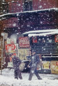
This colour film image explores commercialism and consumerism. My personal interpretation explores the early days of manufacturing companies that have now transformed into huge global firms. The transformation of customs in our society is explored by the post men. When this photo was taken the post men appear to be dressed very smartly. Almost suggesting receiving a letter was a special occasion now days due to technology personal letters are far less of an occasion and post companies are far more colloquial. Showing the decline in peoples attitudes to the values of traditional customs.
|
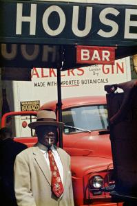
Leiters intentions for his photograph series are about portaying a 'pioneering America' a nation that never stops growing. The multiple signs around the image represents a change of power in society, people are begging to have the ability to voice themselves. This demonstrates a political transformation in the 20th century.
|
Performing For The Camera at Tate Modern
The performing for the camera exhibition explores the relationship between performance and photography. It depicts the transformation of identity as well and "how photographs have captured performances by important artists" Artists such as Erwin Wurm and Francesca Woodman have replicated a hypothetical stage in which the subjects perform for the camera therefore exploring the transformation from reality to fantasy.
|
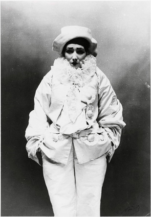
For me one of the most striking images in the exhibition was form the works of Felix Nadar, using gelatin silver print on paper. Sarah Bernhardt in Le Baiser (1894) explores the relationship between the subject and camera through her implicit emotion. The irony in this image is that the she appears fragile and timid yet she is dressed in bright white, ruffled clothing almost like a clown therefore portraying a sense of humiliation. However the exhibition "performing for the camera" expresses the wider question of how much is this image her raw emotion and how much is she playing up to the camera, The over all intention of the exhibition is to depict the transformation between realism and artificiality. It's impossible to decipher the difference through out the exhibition. Yet still Nadar has captured such vivid emotions, whether they are real or not, the viewer still fully absorbs these emotions. |
Exploring Transformation elements outside the Tate.
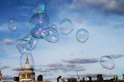
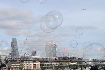
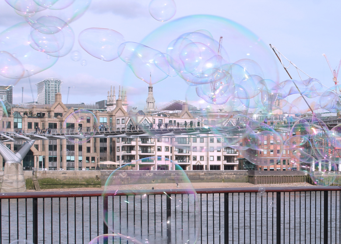
This set of observations explores the transformation of reality to fantasy. It takes a image of a city scape and transforms it into abstract, sureal piece. It also looks at a changes of state an initial idea I had in my mind map. The ordinary soap is transformed into a translucent bubble which is eye capturing and distorts the image transferring a boring background into an engaging, modern piece.
|
|
|
I decided not to continue with this observation. It would have been interesting to go on to experiment with chemicals, create and capture different physical changes however my intentions were to create an underlying, subtle transformation and not as physically transforming.
Transformation of the camera
The aim of this task was to explore how the camera has transformed physically through out history and how these changes have effected the style of image. Bellow I have taken 4 images that explore different types of photography
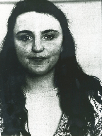
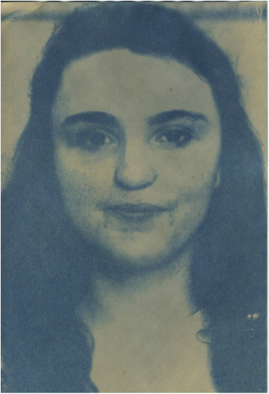
Film Cyanotype
|
|
|
This Film image creates a grainy texture. It was developed in the dark room by printing the negative images into positives. The developed in fix,stop and developer. Although film photography creates beautiful contrast it is a less common process today as it is more lengthy and tedious process.
|
The cyanotype was created by a process reliant on the sun. We took our acetate printed images and a sheet of glass and turned the picture face down and pressed the glass against it for 15 minutes. Then we peeled the images off the glass and soaked the paper in water. It was a very interesting process and creates a beautiful blue, watery tint to the image almost as if the final dry image is soaked in water.It also creates and interesting thick depth to the image.
|
Acetone Transfer Digital
|
|
|
The Acetone transfer was made by taking a regular image, printing it on acetate paper and then pressing it against paper and applying nail varnish remover on the back and then the image seeps through the paper with a grainy effect.
|
This image was taken digitally with a DLSR camera. The advantages of this type of camera is that the image has the best quality resolution and clarity, making the image very clean cut and focused detail.
|
The transformation of the camera is a really important aspect of photography. The type of photography dominates the tone and artists intentions of the photograph. What's more is the different techniques alter the representation of the image. The acetone transfer, with the rough, vague texture that is faded, could represent a lack of identity. The clarity of the digital image emphasises a certain proudness and prestige to the image fitting the intentions for a school photograph. The cyanotype technique presents the image in a surreal way due to the thick watery texture and the grainy film camera ages the piece and represents the beginning of time transcending as film photography was extremely common before the digital camera was invented in 1975.
Object Transformation
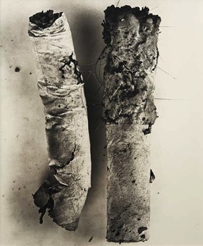
Artist: Irving penn
|
Penn's approach to the still life evolved over decades; from the 1930s onwards, he arranged everyday objects to create assemblages, transforming what was originally a random object into a vision of beauty. Penn picked up these butts on the street. He would then bring them into the studio and started creating these minimalist compositions. The simplicity of the subjects juxtaposes with the sheer detail of the cigarette which creates beauty. There is also an eye capturing contrast of the white paper from the cigarettes to the thick black ash residue He transformed one of the most widely consumed and discarded products of consumer society from that of pure detritus into a symbolic representation of contemporary culture. There is also irony in the photo as he turns an abominable habit into a vision of beauty.
|
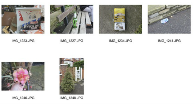
Natural Environment
Studio Environment

|

|
We took the discarded tree from an ordinary garden and brought in into the studio under the studio lights. Transforming the environment of the tree transforms how we see the tree. Initially it seemed quite dull and boring whilst in the shoot there is a sterile appearance to the photograph. Like Irving Penn the colours and the objects are very simplistic but it is the simple contrast of the green and white which makes this image interesting.
|
|
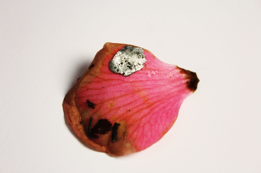
I took my next object transformation from decayed flowers on the street. In the studio environment I picked apart the petals to simplify the image. The petal I chose was particularly interesting because there was a noticeable transformation of colours. What was originally pink soon became pink, brown, and black. The image was also interesting because attached to the petal was a spec of silver which created a nice contrast from the hard silver against the soft petal.
|
|
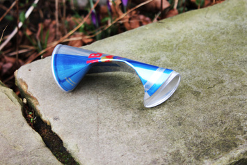
I took this discarded can into the studio and crumpled it further to create texture and to vary the light bouncing off the object in different directions. Although it is a simple discarded can like Penn he transforms something simple to a more engaging object.
Transformation of Space JR: Potrait of a generation.
The transformation of space is about exploring the transformation of a selected environment and turning it into engaging street art.
|
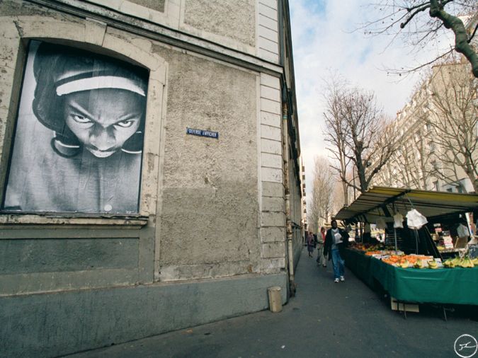
The project of a generation was designed by JR. initially it was illegal to change the face of buildings with out permission but this art movement soon became legalised as the authorities recognised the positive impact it had on youth's lives. It gave the opportunity for young people to view and enjoy art work especially to people who never really had the upbringing of going to museums. It also gave a fresh perspective for the youngsters and they became engaged with the style. It was a successful movement an many of the young people realised art was not just about old fashioned paintings. For My response to this I captured images that we had displayed from our previous Myra Greene portraiture work. The particular image above is interesting as it explores anger and violence in the youth of today and could possibly be viewed as propaganda to prevent street crime. My response explores identity of youth.
|
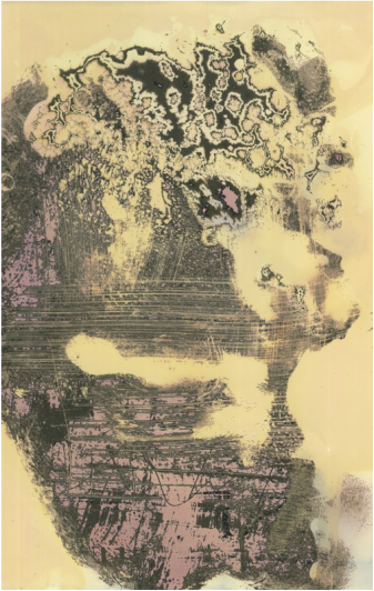
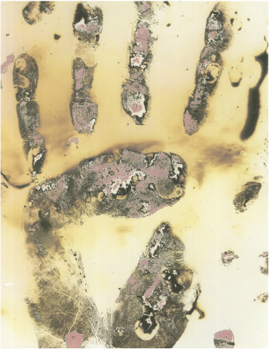
Saya Siguwara- Photographer in residents workshop
For this work shop we used Nivea prints and chemigrams ; an experimental art piece where a photographic image made by painting on a light-sensitive paper (such as photographic paper). The interesting aspect of this work shop was you could be as bold as you like with different features. No piece ever came out the same and the images could be adapted even after developing them like with bleach or scratching the surface.
|
|
These prints were taken from my hand and the side of my face. To create the scratchy texture we applied sugar, oil and an orange soda then put them in the fix. The fix enabled the pinky orangey colours to seep through. The image on the left was used as a tester. The image on the right in particularly interesting because it printed out to look like a shape of a scull and only became visible in different parts of the face making it just recognisable as a face. This closely links in with the theme of transformation as explores the transformation of shape and perception.
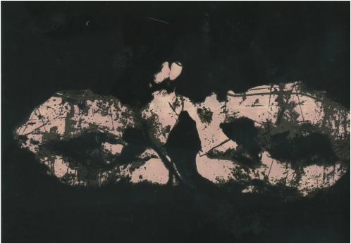
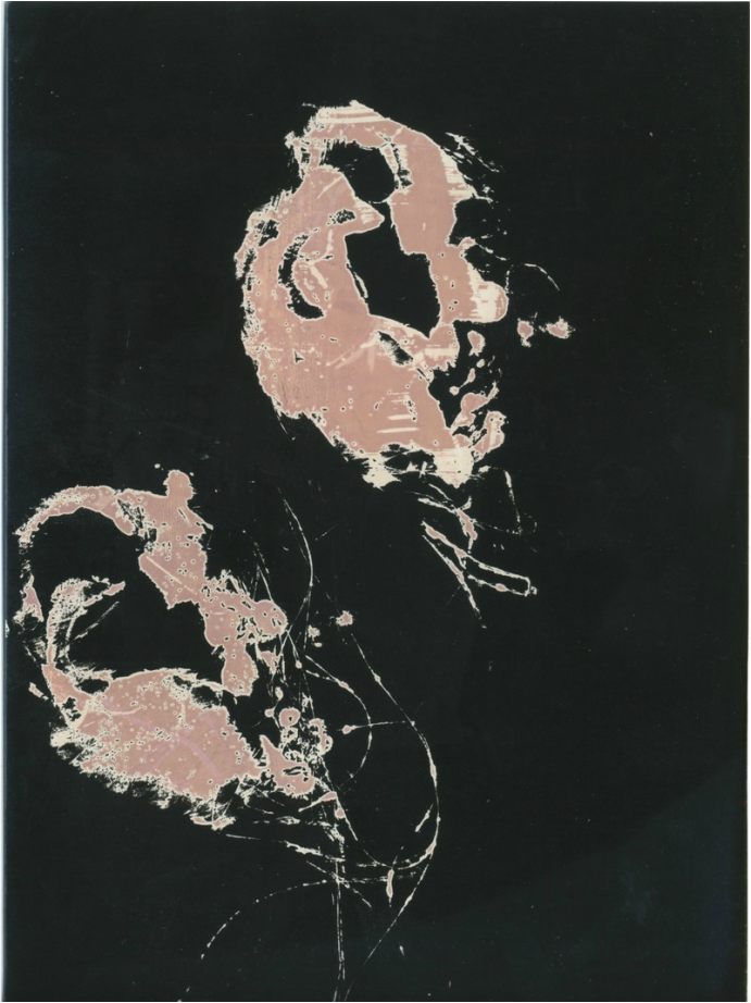
By the viewers, these images can be perceived in so many alternative ways. They can be read at face value- In these images the prints are from my eyes in the first image and ears in the second image. But for me an alternative reading from the ear prints looked like two balloons floating in a black sky. The transformation of perception is what makes these images beautiful. To get the black and pink contrasting colours we went through the same process of applying the sugar, oil and soda. but this this time instead of putting them in the fix we transferred it back and forth in to the developer liquid as well which created the darker black tones.
|
|
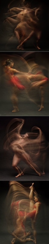
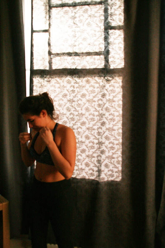
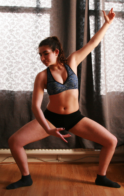
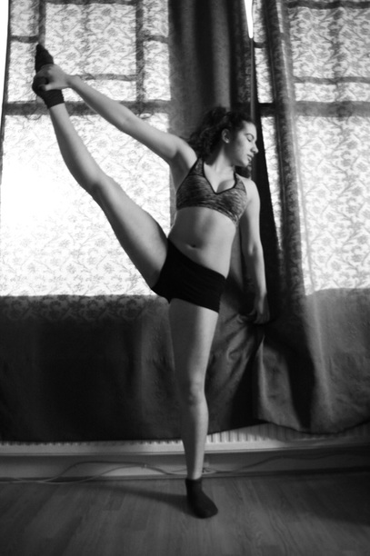
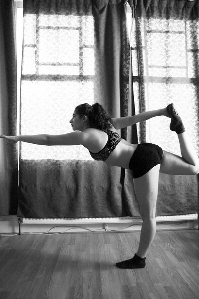
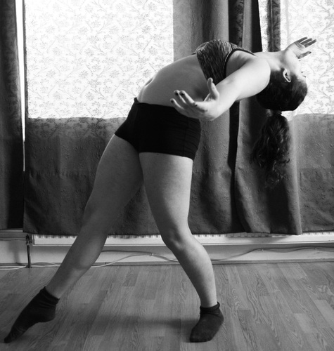
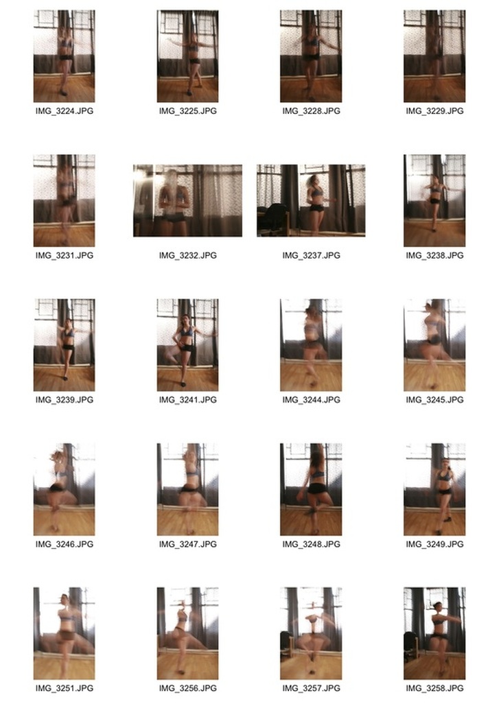
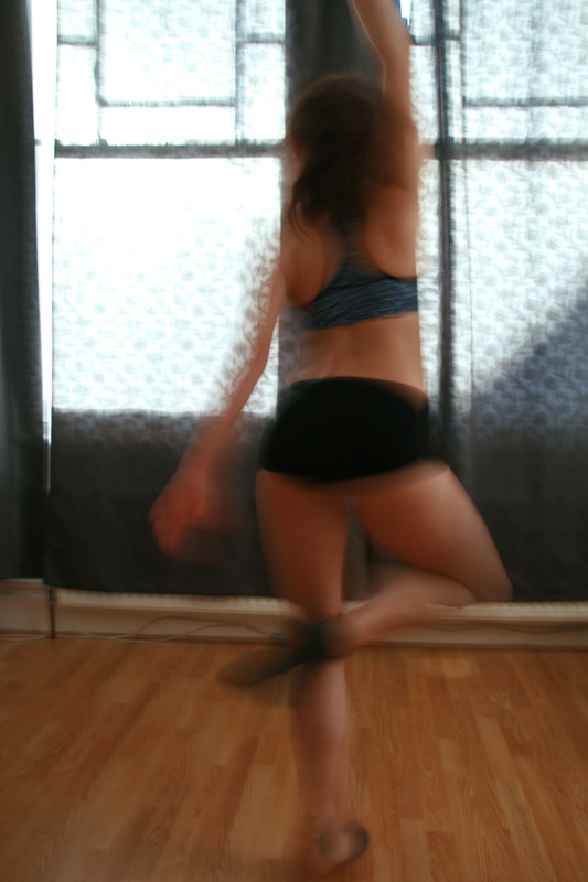
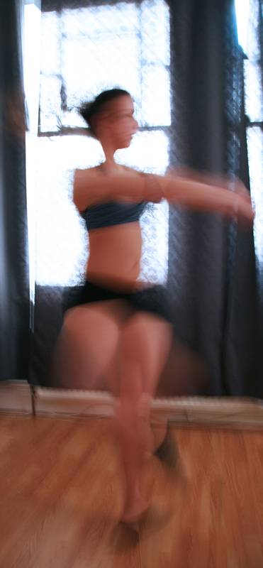
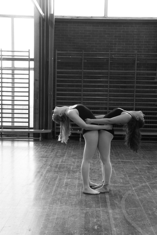
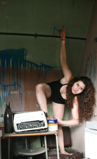
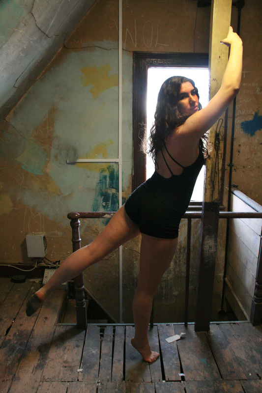
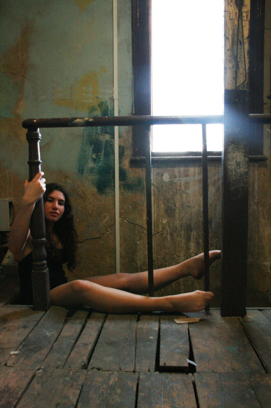
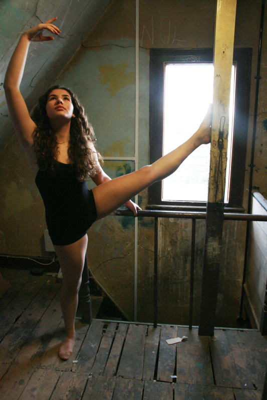
Strand One - Transformation Of Movement - 1st development
I was inspired by movement to tie in with the theme of transformation because I wanted to express transformation through abstract and beautiful ways. So I decided to express transformation through movement of the body and to explore the different ways in which the body can transform. This strand will closely look at the physical expression of the body.
|
|
|
|
|
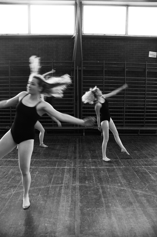
I chose the setting of these five images because I wanted a plain and simple space and I wanted delicate, gentle movements to make the images appear effortless and graceful. The lighting also fits well because it is coming from behind which highlights faint patterns in the background to emphasise the softness of the image. I chose to photo shop the last three images in black and white to create fine-grained tones. All of the photos were taken digitally on Aperture priority with F stop 5.6. In each image I Increased the brightness and contrast to enhance the clarity.
The lighting worked well in the setting because it softly hits the body in different places that draws the eye and create contrast. However the images would have had a cleaner feel to them if the camera was slightly more focused. Although the editing and lighting were intentionally subtle it nicely juxtaposes with the subject's strong, powerful and expressive movements. The images explore the transformation of movement expressed by the individual poses of the body. The subject wore minimal clothes to create natural beauty and emphasise a strong feminist out look of the body. Not only does this explore transformation of movement but also the transformation/ freedom of expression which advocates power and beauty through out the series of images. |
For example the clenched fists in the first image creates a feisty warm tone to the image. The wide spread arms and legs in the second image portray a sense of openness. The wide stretched leg in the third image empowers the subject in a beautiful fashion. The abstract- stretched body shape with the subject looking directly forward following the arm highlights a sense of serenity and calmness in the image. The final image is pleasing to the eye because there is a smooth curve that runs up the body. The bent spine is engaging itshows new kinds of liberating movements. Whilst shooting the images I asked the subject to never look at the camera and mostly to look down so we can never see her eyes. This almost conceals part of her identity and contradicts her strong movements but highlight the submissive tones expressed through out the images.
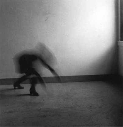
2nd Development Of Movement - Francesca Woodman
Francesca Woodman, a contemporary American Photographer was best known for her black and white portraits of different Women often they were self portraits. Woodman took photographs from the age of 13 and would often reflect her own experiences through her photographs. Her pictures are very gritty and raw. They deeply reflect her mood. She was not only influenced by surrealism and symbolism but also by more contemporary ideas like fashion. "Woodman’s photographs create extreme and often disturbing psychological states. In concealing or encrypting her subjects she reminds the viewer that photographs flatten and distort, never offering the whole truth about a subject."
|
Woodman captures a variety of ancient and post modern elements in her photos to create timeless classics. Baroque paintings were a huge influence on her photography. When comparing this image to the one below it is evident that the same graceful and serene tones are also captured below. Which reflects her intentions of creating a purposeful tone of grace with under tones of sadness. Like my response there is a strong focus on the positioning of the body and how body language and gestures can capture the whole essence of the photograph and induce the emotions of the photograph onto the viewer. |
|
|
|
This image explores the relationship to the movement of the body compared to its surroundings. The position of the body reflects the timid atmosphere and this is done intentionally. The high heeled boots represents the femininity and this contrasts with the slow exposures she uses to create a lack of identity. The crouched position exposes her vulnerability.
|
The girl in the white dress explores the idea of gender her open movement on the slow exposure again conceals her identity but the big movements against the harsh grey back grounds creates a sense of naivety for the subject. The slow exposure blurs her into the background. Woodman often used spacing to evoke a sense of claustrophobia.
|
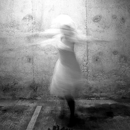
My Response
|
|
|
WWW: These images turned out well because they capture abstract body shapes in motion and the lighting creates a warming tone and blends the subject with the background.
EBI: The location was more relevant to the piece. 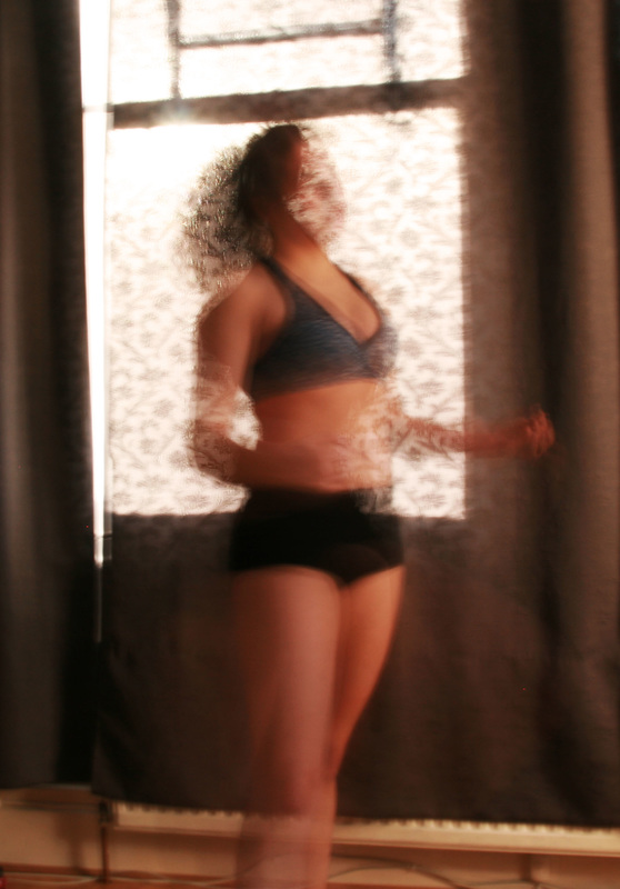
|
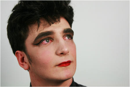
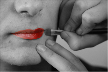
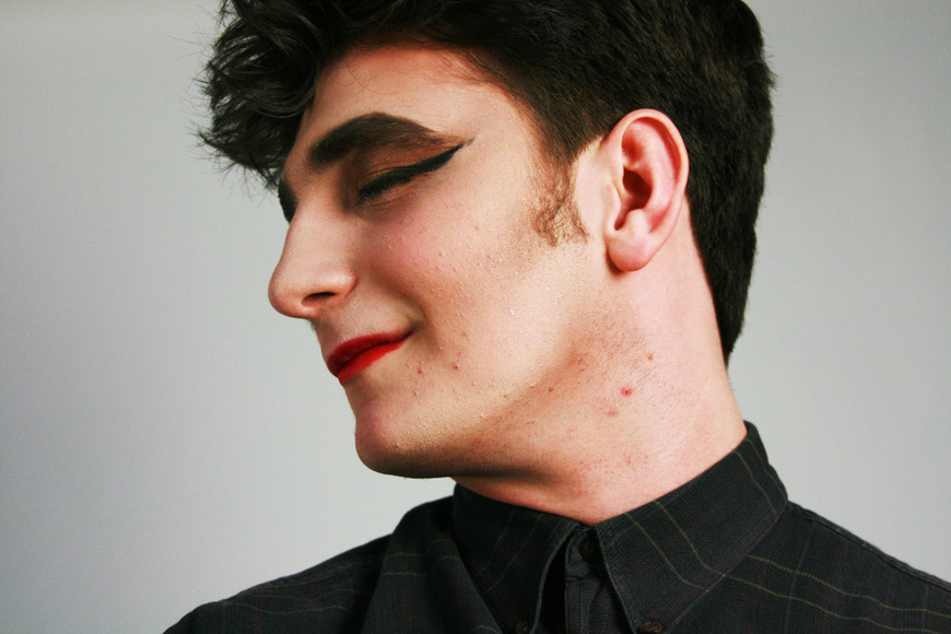
Strand Two- Cindy Sherman; Alter ego

|
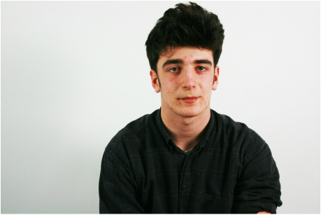
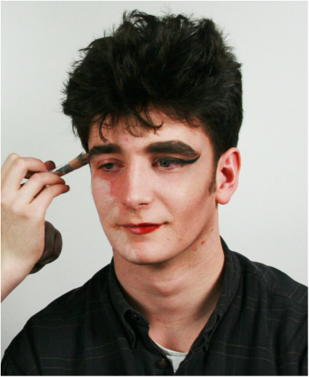
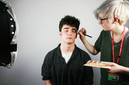
Artist Cindy Sherman explores alter ego through transforming her self image and identity characteristics. It makes the viewer consider why human beings desire to transform their natural being and what influences their transformation.Sherman says "We do it to play up and manipulate our features; to peacock, colour in, draw moons of light around our eyes and shades of suggestion on our lips, to make ourselves more visible. The other, not unrelated motive, is to hide in plain sight." Here I think she is suggesting that we as humans like to wear masks and present our personal best qualities on this mask. The only qualities we want society to see therfore hiding our insecurities "in plain sight" I decided to use Sherman's concept of alter ego and physically transform my subjects face. Whilst photographing I found that not only was this going to be a physical transformation but I could see the subject automatically began to behave in a different manner, Initially He began the shoot feeling quite shy and awkward but as the make up artist began to transform him more and more he started to take on the feminine role and behaved in a camp manner. He also felt more confident with him behaving in a different manner with make up as it masked his true identity which echos Sherman's theory. I selected the photos that showed over time the subtle transformation of his ego and physical face.
|
|
|
Strand Three-Gentrification
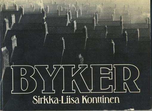
Byker: Sirkka-Liisa Konttinen
|
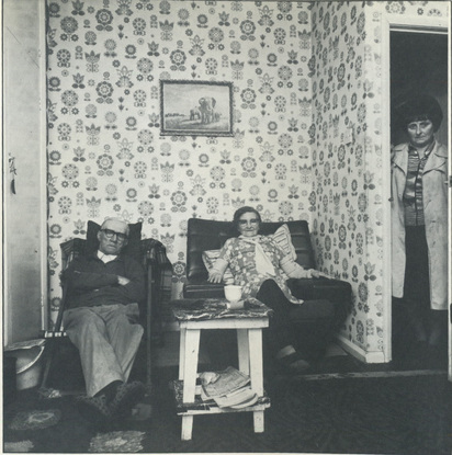
The book Byker is a series of photographs captured in a small .town near Newcastle called Byker through the 1900's, of peoples day to day lives. After reading the the book the most striking aspect that was reflected through the images was the sense of community through the residents of Byker and Photographer, Konttienn quickly became apart of that community and she intended to follow peoples everyday lives. "For me... the vision began from the hill,sweeping down along the steep cobbled streets with row upon row of terraced flats.... Smoking chimneys offered me no paradise; but i was looking for a home." Another interesting aspect of the series is the concept of technology for the dated town. When Konttinen went round asking to take people's photo most people responded "sorry pet, but I'v never had a photo took of me in my life" Therefore one idea of transformation that relates to the series is transforming technology and customs.
|
|
|
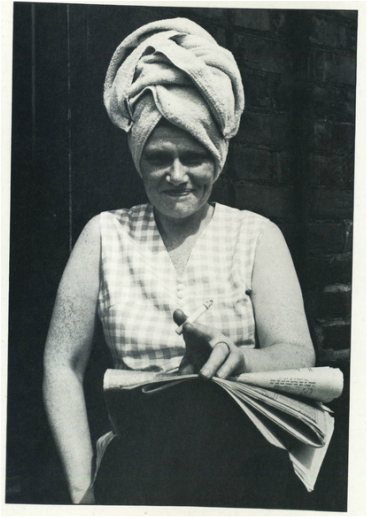
This image is particularly engaging. There is no performing to the camera and the photo captures this woman. everyday life. It depicts a working class woman, despite her financial hardship she appears happy and upwardly socially mobile. From the picture we can infer that she doesn't care what others think of her because of the comical towel on her head, whilst sitting on a street step.This may have been socially unacceptable to another class in those days but the beauty of this picture is that she really does not care. The Byker Series explores the way of life before the Gentrification of Byker. (Meaning the the process of renewal and rebuilding accompanying the influx of middle class people) Not only does Byker series explore the physical transformation of the buildings and surroundings but it explores the transformation from the old tight nit community to modern day diversity where most people do not greet each other in the street and everyone's from different up bringings. It was this transformation that devastated people the most. |
|
|

Years later, when the new Byker was built although visually a lot more appealing, the old community had diminished. By the time they re- built it, many of the children had moved away with new families, the old people had passed away and the last remaining original Byker residents hated the new sense of superiority amongst the people. There was an evident disconnection between the people and they did not express the same values as the original Bykers who would joke and laugh on the street. The modern concept was no longer about living for the moment but instead, living for money.
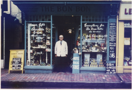
For my response I wanted to grasp a concept that was more personal to my own family history to make the project more interesting . I decided to use my Great Grandfather's sweet shop that he owned from after the second world war on East Grinstead High Street. After a lot of research I managed to relocate the exact same building on the high street to find that now it is an optician. Like the Byker community it is a shame that the legacy did not last as due to the up skill of technology it would no longer last in a a forever transforming economic climate.
My Response
|
|
Annotate this sub strand.
|
|
Tollington Grammar
|
|
|
|
|
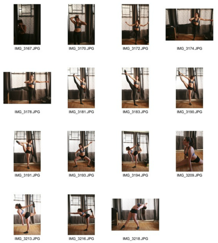
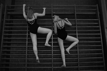
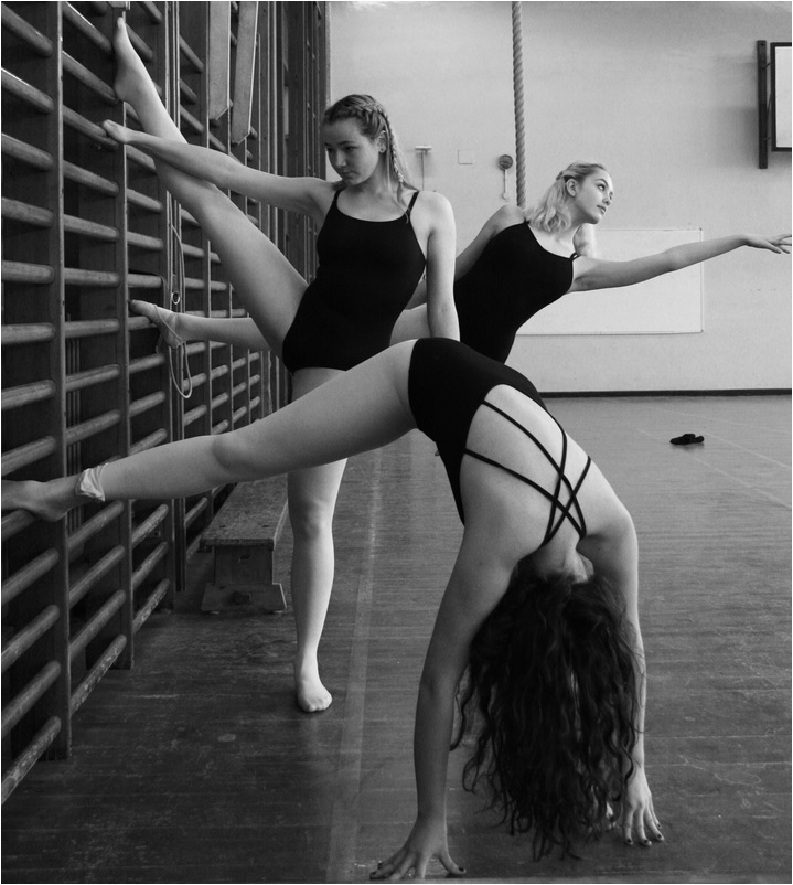
I chose this strand as I liked the idea of having a subtle transformation in the piece and the transformation can be physical through the movement of the body but also the transformation of a background that contrasts with the style of the dancer.
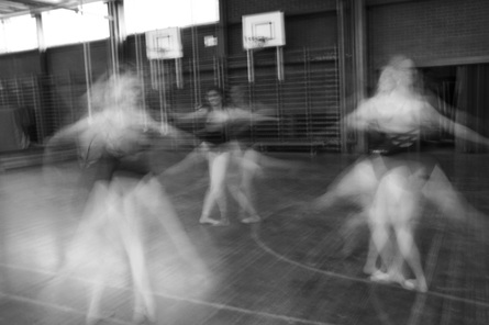
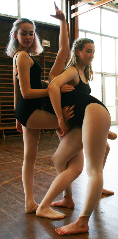
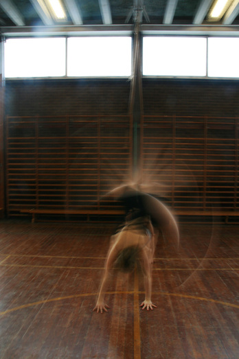
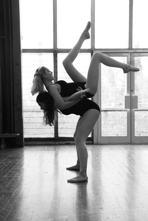
Chosen strand: Transformation of Movement. 3rd development
|
|
I was initially focusing from a feminist perspective on the movement images. To further develop my strand movement I still wanted to create the empowering tones of the image and decided to develop the movement its self, the subjects, and the setting. I chose the setting of the old school gym. Like Francesca Woodman the atmosphere in the photos are very bleak. The gym hall is all dusty and brown in colour. The contrasting textures of the brick wall and the shiny, scratched floor boards created the perfect location for the dancers as they stand out and as they turn the hideous room into an elegant photograph. I did not have specific movements I wanted them to replicate instead I told them to go round the room and freely dance and recite random sequences that they had been taught. They all wore black leotards to emphasise the sense of equality and unity. Again the concept of the strong woman is shown through out these photos. They make the movements look delicate and easy but there are undertones of physical strength required to pull off such complex movements.
|
|
|
|
|
|
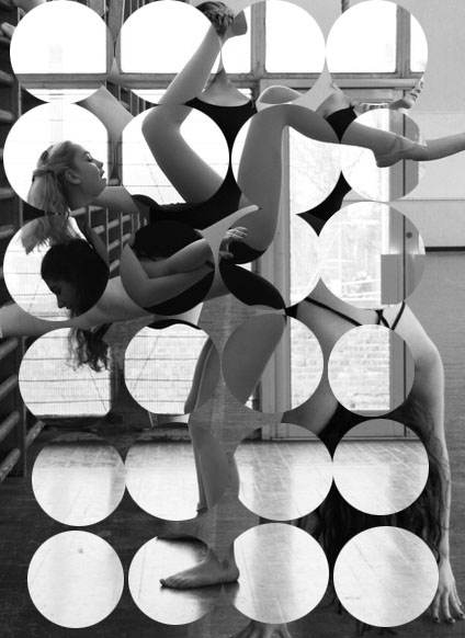
Mini Development- 4th Development -Upload process
|
To develop the previous strand I decided to experiment on Photoshop to add new dimensions to my work. By using Photoshop my pictures became more modern and abstract. I created this image by combining two images on separate layers and then rubbed out the top layer in circular patterns. The transformation in this photography continues with the the transformation of movement and expression, Furthermore there is an underlying physical transformation of layering the two photographs to see them as one. However I quickly decided to move away from this development technique as I felt it took away the simplicity of my photos. Through out my developments I found that the simplicity of the images created beauty. Therefore I decided to focus on small detail and have a less busy image. My new intention was to create a subject were the viewers eye was immediately drawn to.
|
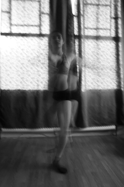
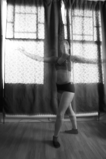
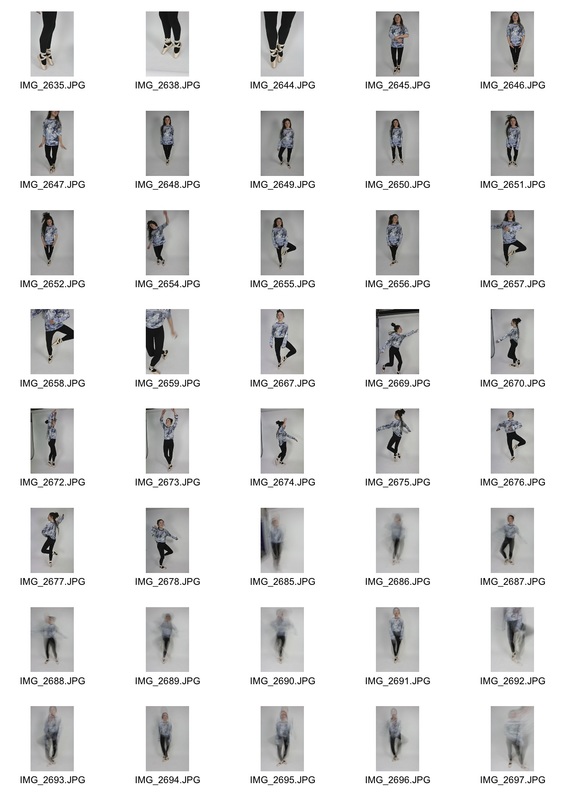
5th Development
For my next development I decided to carry on with the photo shopping elements to create a new abstract feel for the piece. I decided to discard two subjects and just focus on one as I felt like it took attention away from my intentions of creating a piece that shows minor movements of the body therefore for this development I simplified the image by using a white background and one subject.
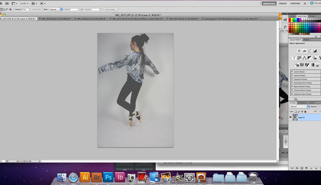
ProcessThe first step was to choose two images that contrasted well. It would have even better if my images were the same size but it does add to the surrealism.
|
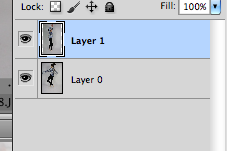
Once two images were selected we had to murge them together by selecting one with Command A. The copy with command C and paste it onto the same page to over lap with command V. This created two layers.
|
|
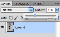
The next step to create the opaque effect was to change the opacity of each layer.
|
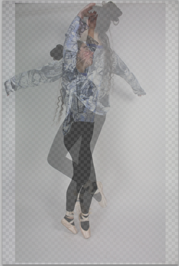
The 4th stage was to rub out the line of merging the lines together to create a neat finish and a realistic photoshop.
|
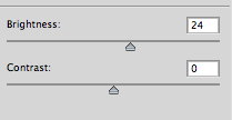
Then the final stage was to alter the brightness and contrast to create an image with more clarity. Then put the image in black and white.
|
For this development I looked at a visual transformation where you could see the subject in two different ways. I liked the movement that this piece brought and clearly demonstrated transformation. However I would rather the subject be in an interesting location.
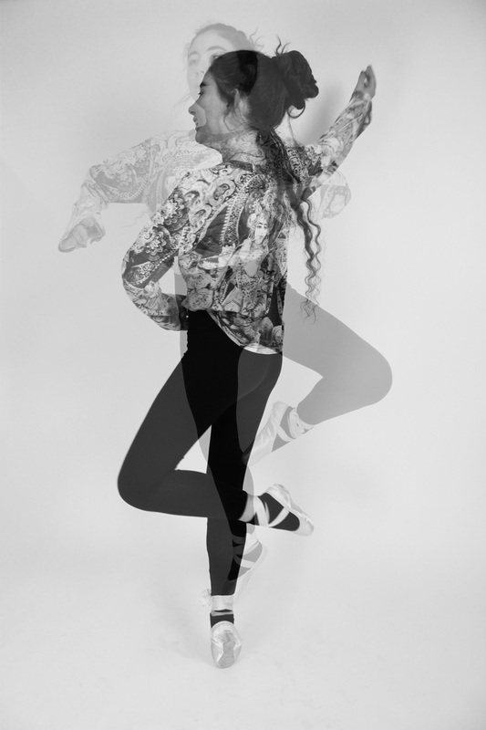
The patterns on this image works well as it looks as if it is printed across her face which creates an abstract dimension. The translucent layer of the subject creates a fanatical shadowed which clearly highlights the theme of transformation. This piece souly focuses on the transforming movement of the body. I intend to demonstrate transforming movement through out my developments as I feel it has worked well and adds an element of beauty.
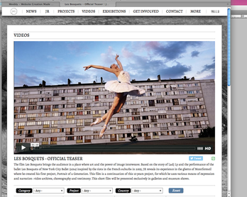
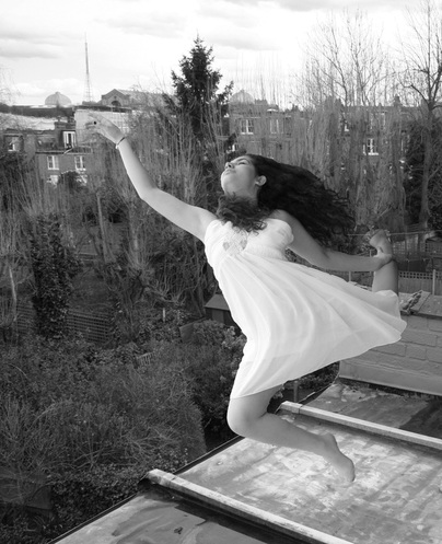
6th Development: JR Les Bosquets- Urban Ballet
|
I was inspired by JR's work because he creates a beautiful juxtaposition in urban ballet. The elegance of the ballerina against an urban estate promotes the innocence of the dance and the danger of the enviroment. Inorder to recreate the riots in paris he produced a video of dancers in an urban, derelict space as a symbol of the de-composure that exists with in society.
He uses physical theatre and the body to create bold, shocking and emotional impacts. |
My Response
To replicate my own version of JR's work I aimed to capture a similar juxtaposition. I used an suburban roof with a city scape background to contrast with my subject in a clean, white dress with relaxed and elegant movements to create a connection between the rough city and the smoothness of the subjects movements. These images were taken on shutter speed priority on 1/200's of a second with an aperture of 4.5 and ISO 400.
|
My intention for this photo was to create a simple contrast between the harsh, gritty roof tiles and dull grey bricks with the innocence of the white dress but It would have been better if I had experimented more with the angles as the straight forward angle is more dull. With the image on the right I experimented with Photoshop to create a really abstract angle. I decided the image does not work as the Photoshop is too false and again takes away my simplistic intentions.
|
|
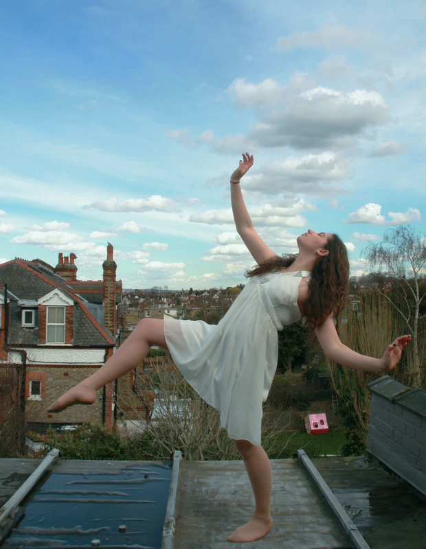
My development of this image solved my previous problems. The angle is more interesting and the pose although still abstract looks physically natural. The pale blue sky and the floaty dress contrast nicely with the dull, wet floor. Looking from the bottom of the image to the top we see a gradual transformation of beauty going from the dark, hard ground up to the light, thin texture of the dress and sky.
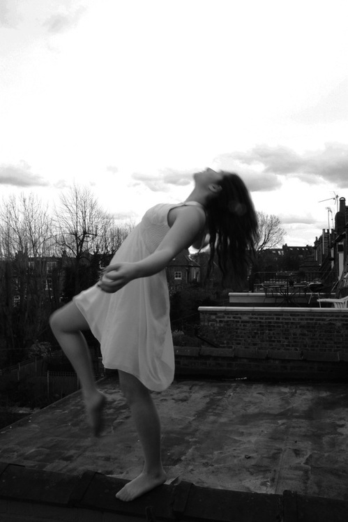
This image bellow follows the same intentions. It is interesting because it also echos the style of Francesca Woodman where her foot and face are just slightly out of focus when most of her body is in focus. It creates a gentle touch of detail, The black and white creates a bleak tone and almost drains the life and colour out of the image. The white dress creates an innocence against the spooky dull background.
Currently I feel like the transformation of the movement is really successful and there are elements of decay in the background. However I want to focus on making a stronger emphasis of the harsh background and intent to find a suitable indoor location. I also am discarding the dress and using a black leotard because I want the subjects outfit to blend in more with the background. I also intend to take my next observation with photos edited the same way to start addressing how I want my images presented.
7th development
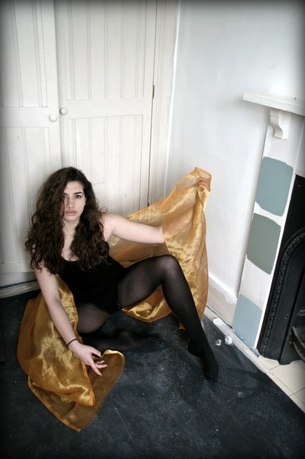
I experimented with using black and white images and then rubbed out the the black and white layer to display the gold cloth. Like the work of Corinne Day it creates an unexpected contrast.
|
|

|

|
|
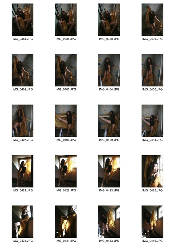
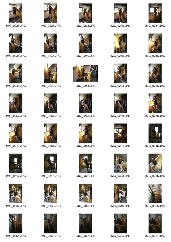
For this development I decided to develop the setting of the subject. They were taken on shutter speed priority of 1/50 and an aperture of 4.5. I simplified the subject's out fit and enhanced the derelict setting which echoes JR's intentions of creating a juxtaposition of decay and beauty. I also introduced a gold cloth as a prop as I felt it would create a contrast of colour and a crisp texture to further carry on with my intentions of creating beauty out of simplicity. I captured a series of abstract positions from a variety of angles in order to demonstrate transforming movement of the body. Each pose captures a different expression which dominates the tone of the image. For example the 4th image is captured from a high angle to make the subject appear smaller. She is also in a crouched position and the gold cloth is very crumpled which creates an uneasy feeling for the viewer and the derelict, dusty floor helps to enhance bleak tones and her sense of coyness engages the viewer. where as in the 5th image the tone is completely contrasting. The subject is stretched out with the gold cloth in an angelic like pose. The light is directly hitting her face and the dominant side of the body. The light also lights up the golden colours helping her to stand out against the dull background. Therefore the tone in this image is much more light and peaceful and showing the transformation in her physical expression.
|
|
8th Development
For this set of observations I decided to experiment with out the gold cloth from the previous set of observations to see if it takes away the attention of the derelict attic. I decided to shoot in the school attic as I felt like it had an authentic atmosphere to create a juxtaposition of beauty against decay whilst also exploring the transformation of expression and movement. For the next two developments I use shutter speed priority on about 1/200 ISO 800 and F stop 7.1 I decided not to continue with the black and white as I wanted background to be more prominent and explore the earthy colours in the attic.
Cloning effect.
|

|
|
|
|
|
Whilst editing my images it was important to make every detail of the image relevant to the piece. Therefore I had to digitally eliminate elements in the attic like boxes and files that were impossible to move but did effect the authenticity of the image. In order to eliminate an object naturally we selected the clone stamp as shown in the second image. Then by selecting 'alt' I had to clone the colours and textures around the box to create a similar colour in order to blend the box in. Once I found a suitable colour I coloured out the box by dragging the mouse up and down. Then merged all the layers together to further naturalize the piece. I will continue to use the cloning effect through out the rest of my work.
Experimenting with photo filters
Intentions
For my final development I wanted to take the same idea as above and develop it further by refining the background. I was happy with the expression and beauty of the subject. I was pleased with the colours and lighting of the photo and I aim to express this same atmosphere for my final piece. However I aim to develop and emphasise the contrast of a background that is more decayed and more derelict. As currently I feel the background lacks a sense of disgust. I want to end up with 4 ,on A3, edited images side by side that clearly demonstrates a transformation of physical body expression. I also want to focus on the transformation of decay to beauty captured in a moment.
For my final development I wanted to take the same idea as above and develop it further by refining the background. I was happy with the expression and beauty of the subject. I was pleased with the colours and lighting of the photo and I aim to express this same atmosphere for my final piece. However I aim to develop and emphasise the contrast of a background that is more decayed and more derelict. As currently I feel the background lacks a sense of disgust. I want to end up with 4 ,on A3, edited images side by side that clearly demonstrates a transformation of physical body expression. I also want to focus on the transformation of decay to beauty captured in a moment.
|
|
In order to give my photos an interesting finish I decided to experiment with the photo filters on photo shop that gave the images a subtle tonal colour. The image on the right has a yellow filter which emphasises the yellow, damp background. The other image has a purple filter that helps bring out the lighting and silhouette of the body. Through out my work I will continue to adapt the photo filter depending on what aspect of the image I would like to highlight. As the attic was extremely dark, I had to really take the light into consideration by constantly asking the subject to move her face in different directions to capture maximum light on her face.
|
|
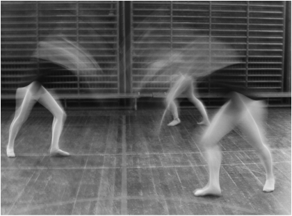
Experimenting with movement.
In these image I think the lighting is exactly right, creating a clarity in the images. However it was hard to find the right location for the light which meant that there was less space to focus on the subjects movement, it would be better if every feature of the body was shown in the pictures..
|
|
|
Another important aspect to my images, is the variety of movement and transforming from different expressive poses.
Corinne Day
Corinne Day, a british photographer had a major influence on the fashion industry in the 90's. She discovered Kate Moss and brought a profound "hard edge' to the fashion industry. She perpetuated the heroine chic movement. Characterised by pale skin, dark circles underneath the eyes and angular bone structure. The purpose of this movement was to create a reaction and shock in contrast with healthy vibrant models like Cindy Crawford and Claudia Schiffe. For my work I looked at the shabby chic aspects of her work and how Day takes a run down location and transforms it to high fashion. I in the same way want to take my run down location and transform the room into beautiful art work. I also want to develop the different styles of movement further.
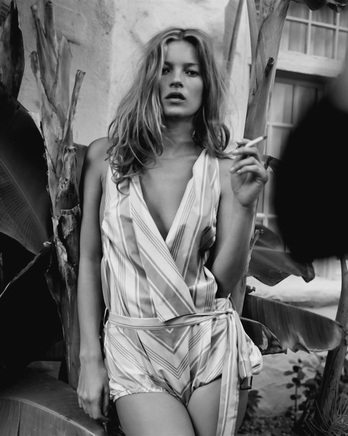
This black and white image has beautiful structural lines that create a balance in the photo. The teared wall paper from behind adheres to lines on her blouse and her v neck. These symmetrical lines create beauty and her skin is the only element with out bold texture which separates from all the chaos behind. The Cigarette in her hand and her ruffled hair creates the "hard edge' to her work.
|
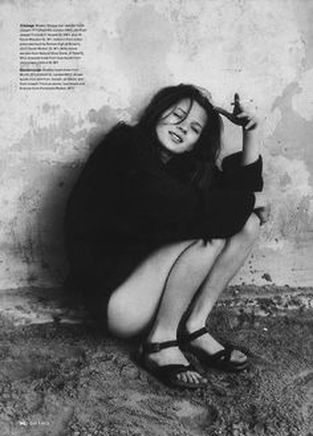
This image really exlpores the heroine chic movement with her skinny legs, her tilted face and her crouched over position. For the viewer it creates shock. It goes against the social etiquette of the 90's seeing a young girl on the street with no trousers. However the thick jacket is the high fashion element and again Day emphases this as it stands out from the derelict background.
|
Artist and Me Comparison.
|
|
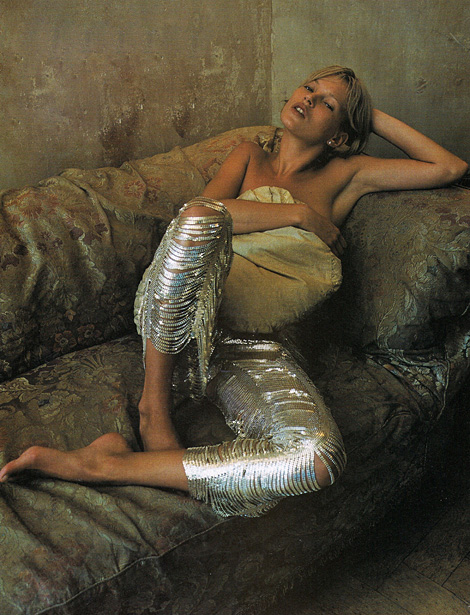
Like Corinne Day I have taken a single element of the piece and made it vibrant and bold. Kate Moss's shiny trousers are shocking and eye capturing like the gold cloth in my image disrupts the dull background. I plan to develop the background colours in my images like the earthy greens in Day's. Both Subjects are crouched with their weight on one side making them look relaxed and almost blends them in with the decayed background.
Final observations.
|
|
For my final development I hold the same intentions as before. I used the same location and re added the gold cloth to create abstract light and beauty to the image. The gold cloth also ties in all the colours together.
Final Piece
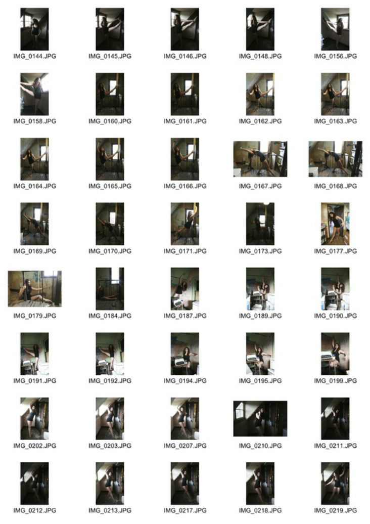
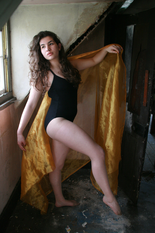
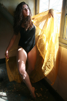
I selected these 4 images together as I felt it is important to have images that connect to each other. They all have distinguishable positions but the gold cloth connects the colours through out. Furthermore the order of images was important. I decided to have the first and last image, with the subject, facing inwards because it is almost as if they are looking at each other which binds the images together in a subtle way. I asked the subject to have a natural face to keep the transforming expressions subtle in order to allow the viewer to discover the underlying meaning of the images as they read more and more into them. The more obvious sense of transformation is the juxtaposition of the abandoned, decayed attic with the fresh light and transforming positions of the human body. The serene aspects of the photographs transform the attic into a work of art. Every individual aspect of the photos were kept simple such as the background, costume and props yet when all added together again it transforms the piece into art.
|

|

|
|
|
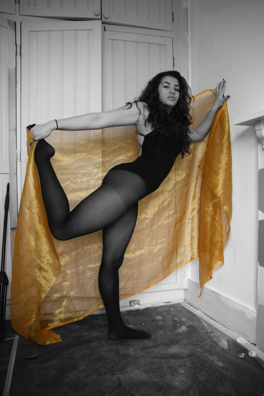
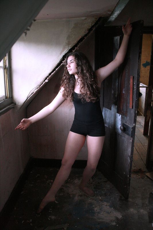
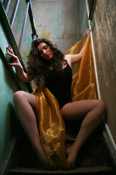
I chose this image because it subtly differs from all the other images I had selected, mainly because of the abstract perspective of the camera lens pointing up, rather than having the image pointing directly at a 90 degree angle. This perspective also makes the subject appear bigger. It also differs as the subject is sat down which creates interesting physicality levels compared to the other images. Her crouched position creates an element of coyness to the atmosphere of the piece showing a clear transformation from the other expressions in the other photographs. The angle of the legs creates an aesthetically pleasing symmetry and the gold cloth creates a fluidity running from the top to the bottom in the centre of the image.
|

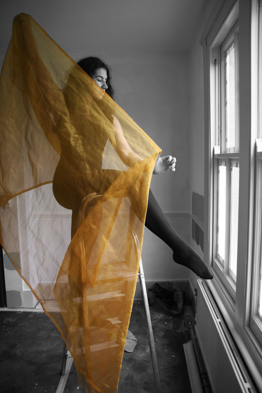
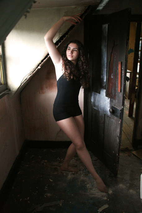
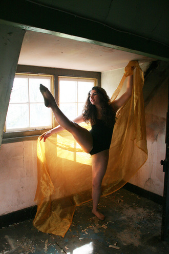
. I chose this image because of the colour and light reflections that become part of her skin. The natural light illuminates the gold transforming a dusty, dull room into a that appears light and airy. This is further portrayed by the body language; stretched out and graceful. Her facial expression is eye capturing and maintains a mysterious element as she gazes out the window.
|
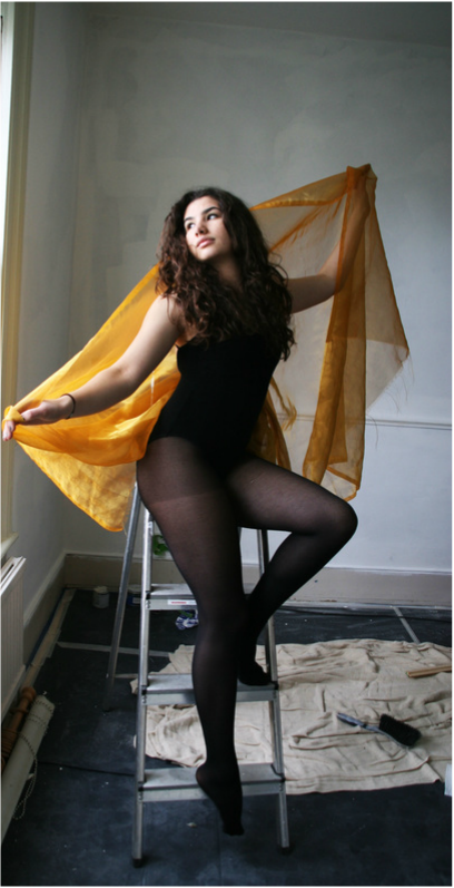
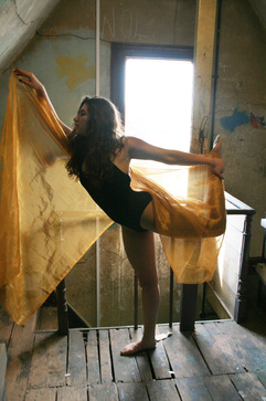
I chose this image because I feel like it stands out the most in terms of movement. The subject takes a difficult stance and makes it look simple which creates a easy feeling to the piece and again the stretched out cloth and arms enhances the openness of the image. The square reflection onto the gold almost acts as a mirror that reflects more light beams. There is a solid structure to the image through the straightness of the ceiling,skirting board and her raised legs which nicely contrasts to the soft, scrunch of the gold fabric.
|

I chose this image because of the abstract movement and how it perfectly correlates to the shape of the fabric. The gold colour brings out the the green and brown of the background. The greeny yellowy tones echo the style of Corinne Day's and the lit up window adds to the interesting perspective.
